
What International Couples Get Wrong About Puglia Wedding Photography Colours
In twenty years of working with international couples, I have almost never had a difficult experience. There is a trust that couples bring from abroad that is genuinely moving — a willingness to believe in the place, in the people, in the work. However, when it comes to **Puglia wedding photography colours for international couples**, there is one common misconception worth addressing directly.
Understanding Puglia Wedding Photography Colours: The Problem and Its Origin
Many international couples arrive in Puglia with a very specific visual idea of what their photographs should look like: electric green fields, an almost unreal cerulean sky, colours so vivid they seem to belong to a different reality. This expectation is understandable — it comes from years of seeing heavily edited images circulate on social media and wedding platforms, images that pushed the colour far beyond what the place actually looks like.
The truth is different. And it is more beautiful.
What Puglia’s colours actually are
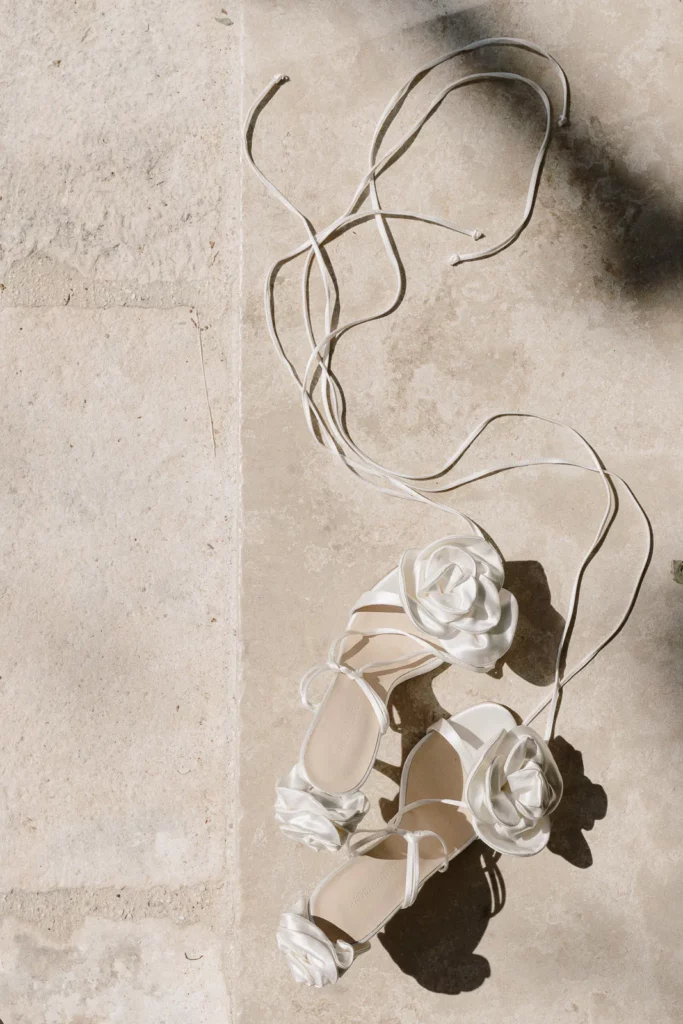
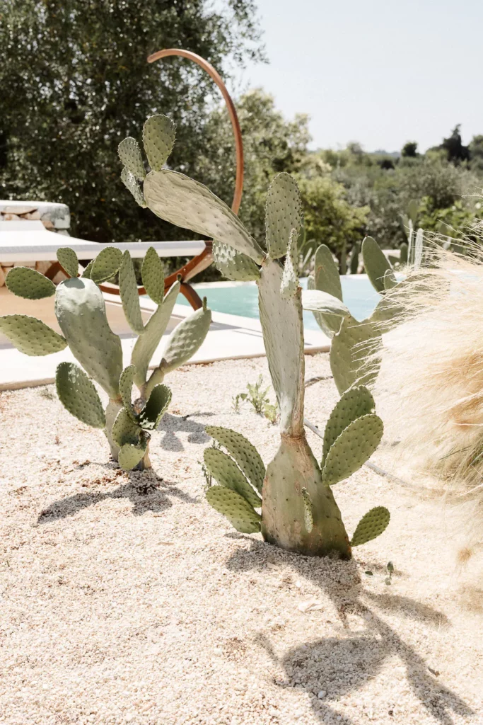
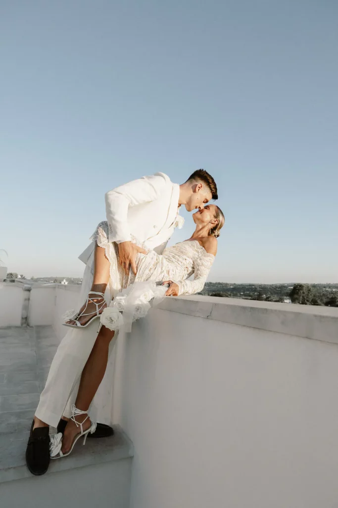
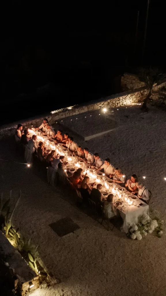
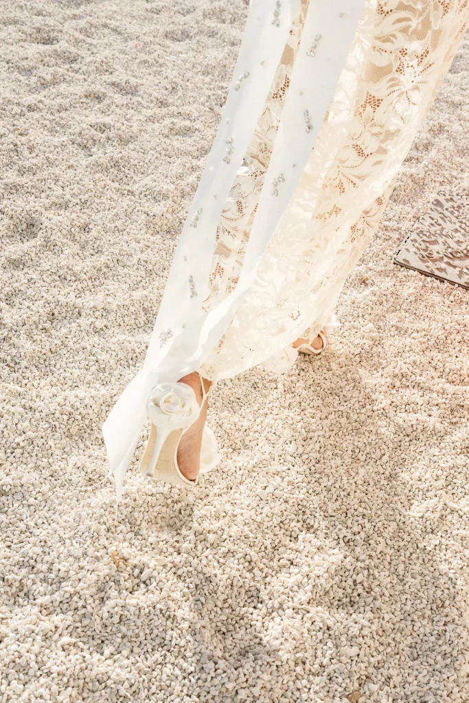
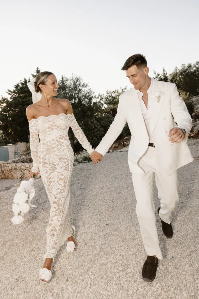
Puglia is light, but it is warmth. The green of the olive groves is silver-grey — never forest, never electric. The sky is deep and clear, with a richness that does not need amplification to be extraordinary. The stone is warm white, the earth is red-ochre, the shadows are long and soft. These are poetic colours, subtle colours, colours that age well and feel real twenty years from now when you look back at them.
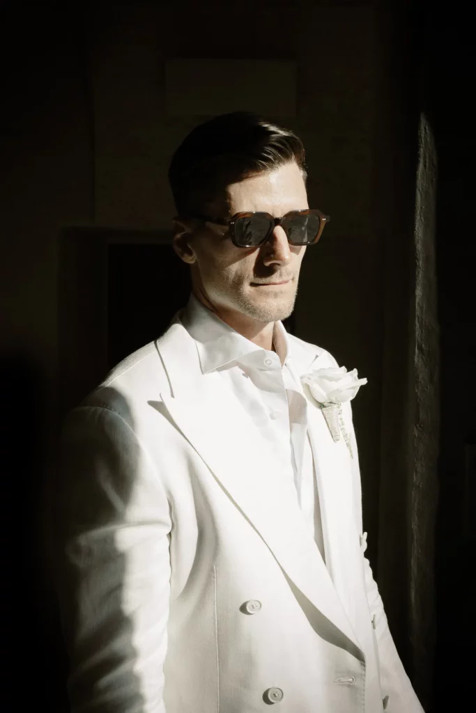
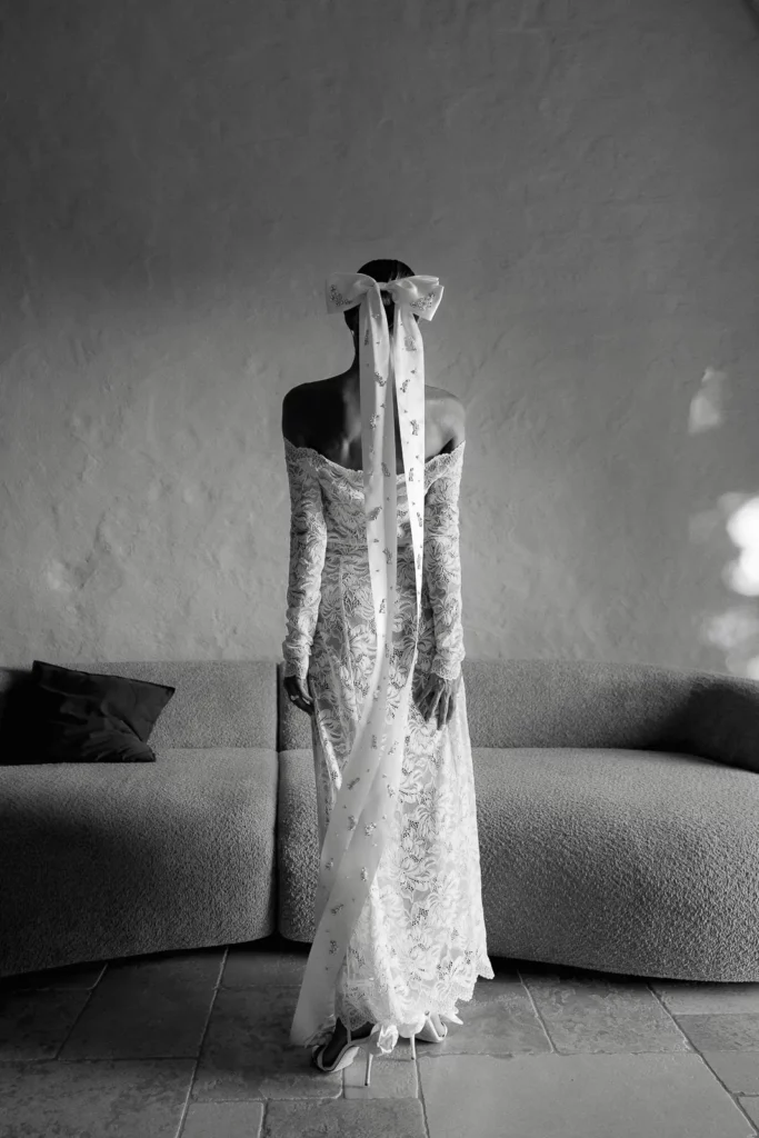
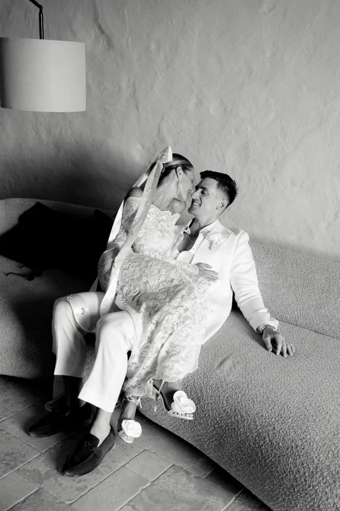
When I edit my images, I do not accentuate — I reveal. I work to bring forward what is already there: the warmth, the depth, the specific quality of this light in this place. The result is images that look like Puglia, not like someone’s idea of what Puglia should look like.
Why authenticity produces better memories
There is no point in changing reality. There is enormous value in enhancing it — in finding the angle, the moment, the light that makes the place reveal itself at its finest. That is the work. And the couples who receive their images almost always understand it immediately: these photographs look real, and they are more beautiful for it.
What I tell couples before the wedding
If you are coming to Puglia expecting the colours you have seen on certain Instagram accounts, I will tell you honestly what to expect — and why what you will actually get is better. Authenticity is the highest form of beauty. Your memory of this place should be true. The images I give you will be true. And in twenty years, that truth will matter more than any filter ever could.
Let’s Talk About Your Wedding.
If you’re planning your wedding in Puglia or anywhere in Italy, let’s discover whether my vision aligns with the atmosphere you want to create.
A RECOGNIZED SIGNATURE THROUGH TIME




Over 600 Weddings Documented
International Publications & Awards
- What International Couples Get Wrong About Puglia Wedding Photography Colours
- Puglia: Italy’s Premier Wedding Photography Destination
- Finding Your Wedding Photographer Connection: It’s About People
- Wedding Photographer in Puglia: People First, Scenery Second
- How Much Does a Wedding Photographer in Puglia Cost in 2027?
